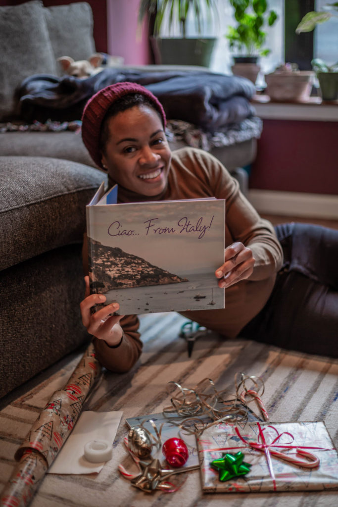
A sponsored post in partnership with Blurb.
Hey all, did you hear the news? This holiday season, I’ve teamed up with Blurb (the independent, creative book-making and self-publishing platform) to create a special holiday gift for my partner. Check out my latest post, Blurb Holiday Gift, to learn why this gift is so special.
Blurb offers a wide variety of photo album formats to choose from. Recently, the platform added a layflat format to its photo book format options. With Layflat photo books, you can turn any photo book into a layflat showcase with a gorgeous collection of seamless spreads. Choose photos that span across two pages to really show off your best trip, memories, and moments. While I love the concept of the layflat, I opted for the standard landscape photo book format instead. I needed a format with options like multiple layouts and collages so that I could really highlight our favorite moments in Italy.
My Book-Making Process
So, let’s pick up where I left off in my last Blurb post – the book-making process. Blurb makes it easy to create photo books in print and digital form. With a variety of free, downloadable, professionally-designed photo book templates, turning your family memories into a beautiful photo book is a piece of cake! To be honest, the hardest part is the concept, but if you already have one in mind then start creating. Once you’ve decided on the book style, download BookWright – Blurb’s free desktop publishing software. This is where your project will come to life!
I’m not going to lie. It took me hours to build this photo album, mainly because I over analyze EVERYTHING! BookWright offers so many fun features from different layouts to fonts, colors, and texts. I found myself building, deleting, rearranging, and starting over several times. What can I say, I’m a perfectionist (inserts emoji hands covering face). After having an internal chat with myself, I finally got into the swing of things, happily reminiscing about my trip as my project came to life.
Here’s a few tricks I learned during the process:
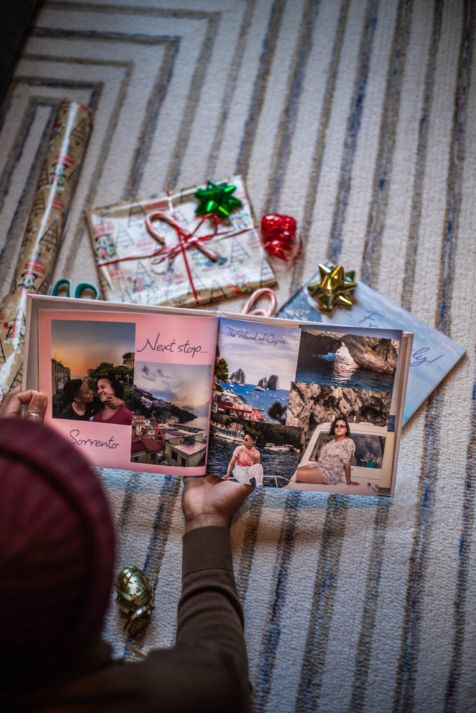
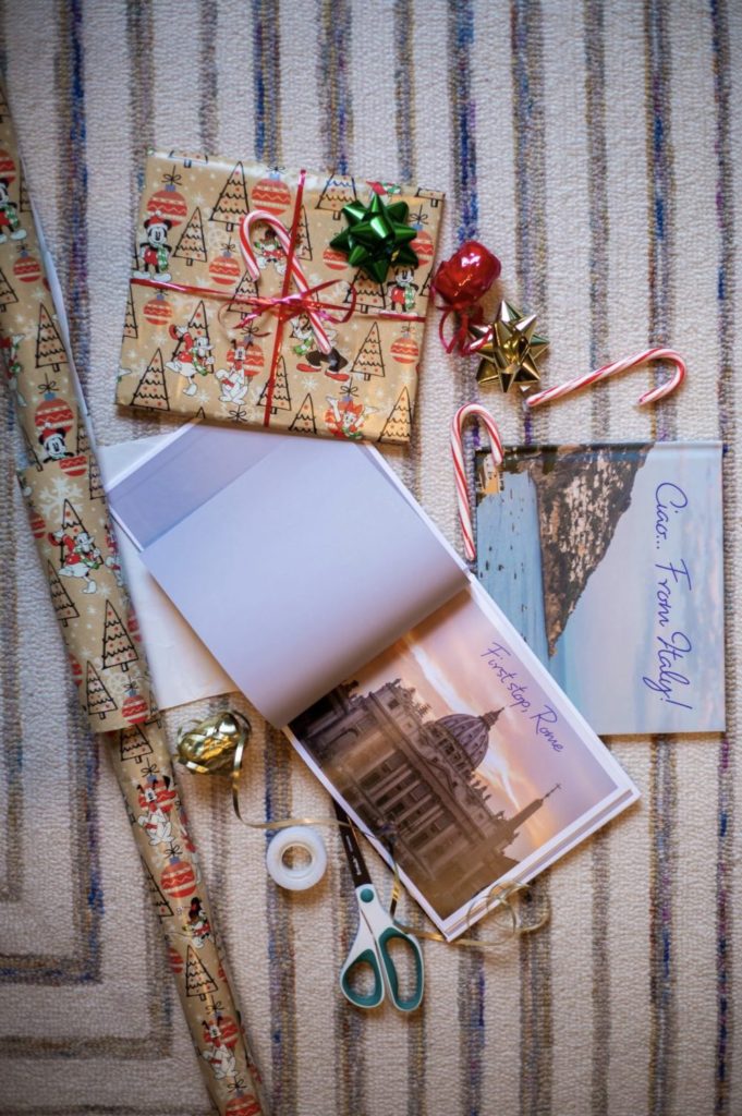
- Take advantage of the layouts. Each page operates as a standalone page. This allowed for me to get really creative. The concept of my photo album was to highlight our favorite moments in Italy. So, every few pages I shared memorable moments of the cities we visit in order of travel.
- Add background colors. Our trip took place at the end of the summer so the cities were full of vibrant colors especially Sorrento and the Amalfi Coast. I added a variety of pastel colors through my photo album to compliment the images displayed. Test your creativity, add pops of color or prints and patterns.
- Draw text. Remember, this is your project so you are free to write anything you’d like. I used the feature for catchy phrases and location details. Another cool feature about the draw text is that you can shift the text box or words in front of or behind an image. It makes for a cool layer. Try it out!
She loved it!
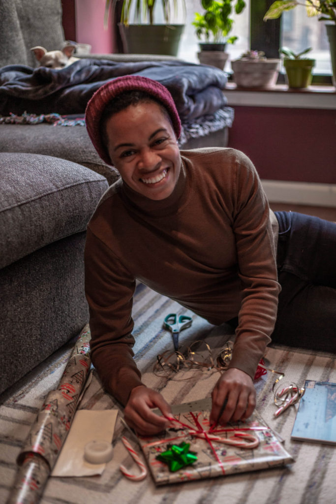
Christmas came super early this year, but I’m not mad at it. My partner was blown away by the gift. I can’t even describe the look on her face. Let’s just say her eyes smiled and she was grinning from cheek to cheek. Ohhh… and she made space for our the album to be shown off in the middle of our diy bookshelf!
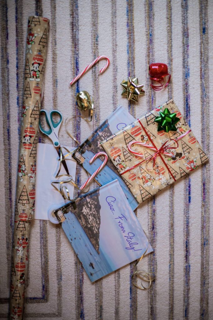
We are both suckers for diy projects. We were so happy about how our photo album turned out that we decided to gift copies to our loved ones. We can’t wait to see the look on our family members faces when they unwrap their gift.






What do you think?